

In August 2023, a drug company shared big news. It said its drug semaglutide cut the risk of major heart problems by 20% in a large trial [1]. The trial included adults with overweight or obesity who already had heart disease. Many readers would picture 20 fewer heart attacks for every 100 people. That picture is wrong, and the gap matters.
The full study came out in November 2023 [2]. The trial followed people for a little more than three years on average. In that time, 8.0 out of every 100 people on a placebo, or dummy shot, had a major heart event. That means a heart attack, a stroke or a death from heart or blood vessel disease. On the real drug, 6.5 out of 100 did. So 20% lower meant about 1.5 fewer people out of 100. That is a real benefit. It is also a much smaller picture than most people imagine.
Neither number is a lie. They answer different questions.
What does a 20% lower risk actually mean?
There are two ways to describe the same change in risk. The first is absolute risk. It counts people. In the heart trial, it was 8.0 out of 100 without the drug and 6.5 out of 100 with it.
The second is relative risk. It compares the two groups to each other. The drop from 8.0 to 6.5 is 1.5, which is about one-fifth (19%) of the starting number. The trial’s official 20% figure comes from a method that also accounts for when each event happened. The simple math lands close to it.
The difference between the two absolute numbers is called the absolute risk reduction. Here it was about 1.5 people out of 100. You can flip that into a number doctors call the number needed to treat. It tells you how many people need to take the drug for one of them to avoid the bad outcome.
The paper does not report this number. My own rough arithmetic gives about 67 (1 divided by 1.5 out of 100). It uses the simple counts and does not adjust for timing. On average, about 67 people would need the weekly shot for a little over three years. Then about one of them would avoid a heart attack, stroke or heart death. The other 66 would not get that benefit, either because they would have been fine anyway or because they had the event despite the drug.
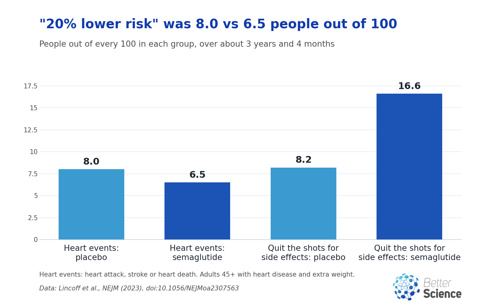
Chart by Better Science from data in Lincoff et al., New England Journal of Medicine (2023), doi:10.1056/NEJMoa2307563.
The chart also shows the other side of the ledger. About 16.6 out of 100 people on the drug stopped it for good because of side effects or other health problems. On the dummy shot, 8.2 out of 100 did. Putting benefits and harms in the same out of 100 form makes them easy to weigh against each other.
How did one warning about the pill go so wrong?
A famous example shows what can happen when only the relative number travels.
In October 1995, a drug safety committee in the United Kingdom issued a warning. It said that newer, third-generation birth control pills doubled the risk of dangerous blood clots in the legs or lungs. A review by a team led by Gerd Gigerenzer later described what happened next [3]. Letters went to 190,000 doctors, pharmacists and public health leaders, and the news went to the media. Worried women stopped taking the pill.
Now look at the absolute numbers behind the warning. Among every 7,000 women on the older pills, about 1 had a clot. Among women on the newer pills, that rose to about 2. So doubled meant one extra case in 7,000 women. The review does not give a time period for these numbers in that passage. That is a good reminder to ask for one.
The authors wrote that “the corresponding relative changes tend to look big” when the starting risk is low. They argued that if officials and reporters had given the absolute risks, few women would have panicked.
Citing a 1999 analysis, the authors say the scare led to an estimated 13,000 extra abortions in England and Wales the following year. That estimate rests on abortion numbers rising after the warning, when they had been falling since 1990. It is a pattern in time, not a controlled study, so the exact number is uncertain. The authors also point out an irony. Pregnancy and abortion carry a higher risk of blood clots than the newer pill did.

What three questions cut through a risk headline?
Three plain questions do most of the work. Gigerenzer’s team suggests similar questions, including ones about the time frame and whether a risk applies to you.
1. Out of how many? Turn the percentage into people. 20% lower risk could mean 10 fewer out of 100 or 1 fewer out of 1,000. You cannot tell until you see the starting number. The same review gives an example about breast cancer screening. A 25% drop in deaths from mammograms meant about 1 fewer death for every 1,000 women screened.
2. Over how long? A risk always covers a time period. In the heart trial, it was a little over three years on average. If a headline gives no time frame, the number is only half told.
3. Compared with what? Every relative number compares two groups, so check who they were. In the heart trial, the drug was compared with a dummy shot, in adults who already had heart disease. A result in that group may not match what happens in a healthier group, or in a group given a different drug.
Imagine a store sign that says Prices cut 50%! You would want to know 50% off what. A 50% cut on a pack of gum saves you pennies. A 50% cut on a new car saves you thousands. A risk that drops by half works the same way. The size of the saving depends on what you started with.
Health numbers are like that sign. The percentage tells you the size of the cut. Only the starting risk tells you how much you actually gain.
Why does the same 20% mean different things for different people?
The same relative drop gives very different absolute benefits, depending on the starting risk.
Here is a made-up example to show the math. It is not a result from the trial. Picture a group where 20 out of 100 people would have a heart event over a few years. A 20% cut would bring that to 16, so 4 fewer people out of 100. Now picture a group where only 2 out of 100 would have that event. A 20% cut would bring it to 1.6, so 0.4 fewer people out of 100. That is about 1 person in 250.
The percentage is the same in both made-up groups. The real-world gain is ten times larger in the high-risk group.
The trial also cannot tell us whether the same 20% would hold in lower-risk people. Its authors studied a specific group. They were adults 45 and older who already had heart disease and a body mass index of 27 or more. None had diabetes. Their conclusion is limited to that group.
Are relative numbers misleading, then?
Not by themselves. Relative numbers are useful. They let scientists compare treatments across studies. They can also help a doctor estimate the benefit for a patient whose starting risk differs from the trial average.
A 2011 guide published by the U.S. Food and Drug Administration explains that the same result can be written three ways [4]. It gives the example of a drug that lowers a risk from 6% to 3%. That can be called a 50% drop, a fall from 6% to 3%, or a number needed to treat.
The problem comes when relative numbers stand alone. The guide notes that with relative numbers, “the risk reduction seems larger and treatments are viewed more favorably.” It adds, “This is as true for the lay public as it is for medical students.” It recommends giving absolute risks, not just relative ones, and keeping the time frame the same when comparing.
The guide also cites a study in which patients found the number needed to treat the hardest format to understand. Those researchers said it should never be the only way results are shown. My takeaway is simple: give more than one form side by side.
Does the heart trial prove the drug works?
For the people it studied, the trial is strong evidence. It was a randomized trial. That means chance decided who got the drug and who got the dummy shot, so the two groups started out alike. Neither patients nor doctors knew who got what. With 17,604 people, a steady gap between the groups is hard to explain by chance or by other differences.
So it is fair to say the drug lowered the rate of heart attacks, strokes and heart deaths in this group.
There are limits. The drug maker, Novo Nordisk, funded the trial. The results apply only to the group studied. And the side effects that led some people to stop the drug are part of the picture too.
I think both numbers belong in every headline about a medical result. 20% lower risk tells you the drug does something real. 8.0 versus 6.5 out of 100 over about three years tells you how much, and who it was measured in. A reader who gets only the first number is being asked to trust a feeling instead of a fact.
None of this means the drug is a good or bad choice for any one person. That depends on a person’s own risk, health history and goals. Anyone thinking about a treatment like this should talk it through with their doctor. It is fair to ask for the numbers out of 100 people like me.
Bottom line
A relative number tells you how much a risk changed. An absolute number tells you how many people it changed for. In the heart trial, 20% lower risk meant about 1.5 fewer heart attacks, strokes or heart deaths per 100 people over about three years. In the 1995 pill scare, twice the risk meant one extra blood clot per 7,000 women.
The next time you see a percentage in a health headline, ask three questions. Out of how many people? Over how long? Compared with what? Those answers turn a scary or exciting number into something you can actually weigh.
References
[1] Novo Nordisk A/S, “Semaglutide 2.4 mg reduces the risk of major adverse cardiovascular events by 20% in adults with overweight or obesity in the SELECT trial,” company announcement, GlobeNewswire, Aug. 8, 2023. [Online]. Available: https://www.globenewswire.com/news-release/2023/08/08/2720343/0/en/Novo-Nordisk-A-S-Semaglutide-2-4-mg-reduces-the-risk-of-major-adverse-cardiovascular-events-by-20-in-adults-with-overweight-or-obesity-in-the-SELECT-trial.html
[2] A. M. Lincoff, K. Brown-Frandsen, H. M. Colhoun, J. Deanfield, S. S. Emerson, S. Esbjerg, et al., “Semaglutide and Cardiovascular Outcomes in Obesity without Diabetes,” New England Journal of Medicine, vol. 389, no. 24, pp. 2221-2232, Dec. 2023 (online Nov. 11, 2023), doi: 10.1056/NEJMoa2307563.
[3] G. Gigerenzer, W. Gaissmaier, E. Kurz-Milcke, L. M. Schwartz, and S. Woloshin, “Helping Doctors and Patients Make Sense of Health Statistics,” Psychological Science in the Public Interest, vol. 8, no. 2, pp. 53-96, Nov. 2007, doi: 10.1111/j.1539-6053.2008.00033.x.
[4] A. Fagerlin and E. Peters, “Quantitative Information,” in Communicating Risks and Benefits: An Evidence-Based User’s Guide, B. Fischhoff, N. T. Brewer, and J. S. Downs, Eds. U.S. Food and Drug Administration, Aug. 2011, ch. 7, pp. 53-64. [Online]. Available: https://www.fda.gov/about-fda/reports/communicating-risks-and-benefits-evidence-based-users-guide
Related Articles