

Most of us have sat through a science talk that lost us by the third slide. The text was tiny, the terms were new, and the speaker read bullet points aloud. Good research can hide behind a talk like that.
Can the design of a talk change what an audience understands? Researchers Joanna Garner and Michael Alley tested this in 2013 [1]. They showed 110 engineering students the same recorded talk with two different sets of slides. Students who saw slides built around one clear sentence and a picture wrote better explanations right away. They also did better on a surprise quiz about a week later. The catch is that the study used students watching a short recorded lesson, not experts at a live conference.
Why are so many science talks hard to follow?
Researchers often know too much about their own project. Every method and result feels important, so they try to include all of it. The audience gets more than it can take in. Unlike a reader, a listener cannot pause a live talk and reread a crowded slide.
Software defaults make this worse. PowerPoint’s standard slide offers a short topic title and a box for a bullet list. Garner and Alley note that earlier counts found this layout on 65% to 80% of slides in the samples studied. A topic title such as MRI scanner parts tells you the subject. It does not tell you the point.
What happened when researchers changed only the slides?
Garner and Alley built an 8-minute talk about how MRI scanners detect cancer. Both groups heard the exact same recorded narration, about 1,000 words long. Students were randomly assigned to one of two slide sets, so the groups should have been similar at the start.
One set followed the common style: a short topic title with bullet points, about 42 words per slide. The other used what the authors call the assertion-evidence style. Each slide had a one-sentence title stating its main point, backed by a relevant picture or diagram. These slides averaged about 21 words, roughly half as many.
Right after the talk, students wrote an essay explaining how an MRI scanner works. The assertion-evidence group averaged 9.4 out of 15 points. The bullet group averaged 6.7. The assertion-evidence group also made fewer mistaken statements, about a third fewer on average.
About a week later, students took a surprise quiz. The assertion-evidence group again did better, scoring about 7.8 out of 10 compared with 5.5. They also rated the talk as taking less mental effort. One wrinkle: this group rated its own prior knowledge slightly higher, though those ratings did not track test scores.
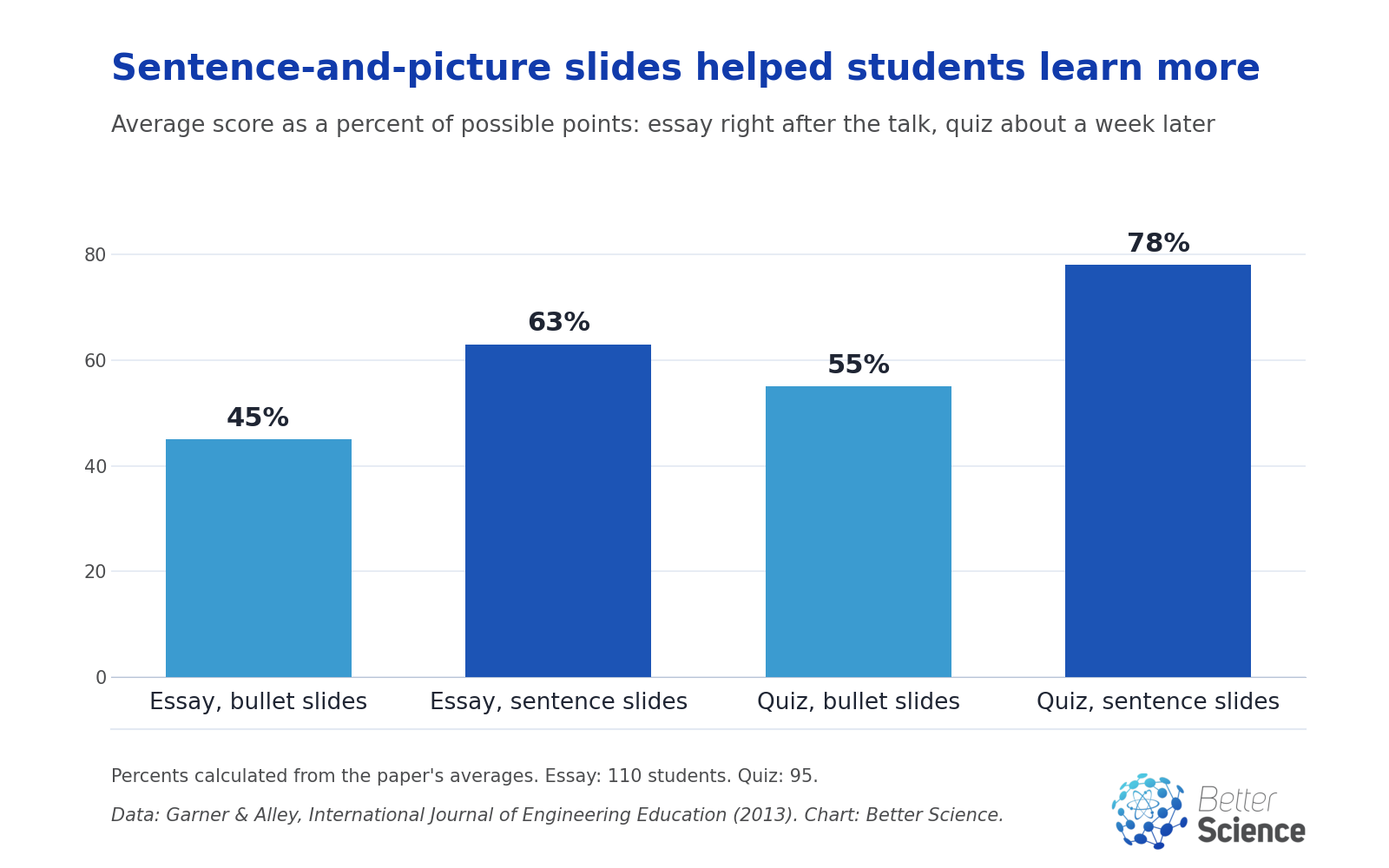
Chart by Better Science from data in Garner and Alley, International Journal of Engineering Education (2013), Tables 1 and 3, author PDF.
On simple fact questions right after the talk, the groups scored about the same. The gains showed up when students had to explain how the steps connected. Oddly, the assertion-evidence group rated the amount of text on their slides as less suitable, even though they learned more. What people prefer and what helps them learn are not always the same.
Does a sentence title help on its own?
An earlier study looked at just the title. In 2006, Alley and colleagues changed the slides in a large geology course at Virginia Tech [2]. Each class section had between 136 and 202 students. Later sections saw slides with short sentence titles, while earlier sections had phrase titles, questions or no title at all.
On 15 final exam questions tied to those slides, students with sentence titles averaged 79% correct. Students with the older slides averaged 69%. In one example, 46% of students recalled a fact placed in a bullet point, compared with 63% when the same fact was the slide’s title.
This study has real limits. The groups were different semesters, not randomly assigned. The slides also changed in other ways, such as fewer bullet lists. And on 2 of the 15 questions, the sentence-title group scored clearly lower. The overall pattern favors sentence titles, but it is not proof by itself.

Why does less on the slide often mean more understood?
The best-known explanation comes from Richard Mayer and Roxana Moreno. In a 2003 review, they summarized dozens of experiments from their lab [3]. Their starting idea is simple. People take in words and pictures through separate channels, and each channel can handle only a limited amount at once.
When a lesson overloads those channels, learning suffers. Three of their nine fixes fit talks especially well:
- Cut the extras. In five experiments, students learned better from a short, focused lesson than from one padded with interesting but off-topic material. Mayer and Moreno call this weeding.
- Point the way. In one experiment, the researchers added cues such as stressed key words, arrows and headings. They also showed a simple map of the lesson’s parts. Students then did better on later problems. This is called signaling.
- Do not say and show the same words. In three studies, students learned better from an animation with spoken words alone. Adding the same words as printed text on screen made things worse. Reading the text pulled attention away from the animation and the speech.
There is a catch here too. When no animation was shown, printed text plus narration actually helped more than narration alone. So the lesson is not to strip every word from a slide. It is to avoid making people read a paragraph while you say it.
These were short multimedia lessons for students, often about how lightning forms or how brakes work. The speech was recorded, so every listener heard the same words. A real talk is messier than that.
Does jargon really turn people off?
Specialist terms are useful inside a field. For outsiders, they can do more harm than we think. In 2019, Olivia Bullock and colleagues at Ohio State University ran an online experiment with 650 adults in the United States [4].
Everyone read short paragraphs about self-driving cars, surgical robots and 3D bioprinting. About half the readers saw versions full of technical terms. The rest saw the same paragraphs with those terms swapped for simple explanations. Separately, some readers could hover over the terms to see definitions.
People who read the jargon version said the text felt harder to process. On a 7-point scale where higher meant easier, they rated the reading 4.6 on average, compared with 5.3 for the plain version. Offering definitions did not remove that effect. Harder reading was linked to more pushback against the message, higher ratings of risk and less support for the technologies.
This was written text, not a talk. The sample was not representative, and the study did not directly measure understanding. Still, it suggests that defining a term is not as good as replacing it.
How do you plan a talk people can follow?
Here is a practical checklist. The first few items rest on the research above. The rest are common sense from experienced speakers.
- Write three sentences first. One for the problem, one for what you did, one for what you learned. That is the spine of the talk.
- Give each slide one job. If something does not help make that slide’s point, cut it or move it to a backup slide.
- Use a sentence as the title. Write Tumors show up because their tissue responds differently, not Results.
- Show evidence, not paragraphs. Use a large, simple figure. Explain the axes and units before the result. Highlight the line or bar that matters.
- Do not read your slides aloud. Speak the explanation and let the slide show the evidence.
- Match the language to the room. Drop terms the audience does not need. Define the few that stay, the first time you use them.
- Keep the uncertainty. Simplify the route, not the result. Say what the study cannot show.
- Practice aloud with a timer. Silent reading hides awkward sentences and rushed sections. Ask someone from the intended audience where they got lost.
- Plan the first and last minute. Open with why anyone should care. End by repeating the one thing you want people to remember.
A small example shows why the title matters so much.
Picture two talks on the same study. In the first, the slide says Methods above eight bullets, and the speaker reads them. In the second, the slide says We scanned 40 patients twice to test whether the method repeats, with one photo of the scanner. Most people will remember the second one.
The first slide gives the audience a topic. The second gives them the point.
Do these rules work for every talk?
Not always, and it is fair to say so. Most of this evidence comes from students learning new material, in classrooms or online. Experts in their own field may handle denser slides well. A lab meeting where colleagues want to inspect raw numbers may call for a detailed table.
Alley and colleagues make another fair point. In Mayer’s experiments, the narration was recorded and perfect. Real speakers improvise, answer questions and sometimes add detail to build trust with the audience. They also note that slides are often shared afterward as notes, which is common in science and engineering. In my view, that pulls slides toward more text.
So these are strong defaults, not laws. A public talk, a job talk and a lab meeting need different amounts of detail.
I am a researcher trained in medical physics, and giving talks is part of the job. My reading of this research is that the single most useful change is the sentence title. It forces the speaker to decide what each slide means before anyone else sees it. Much of a confusing talk is really unclear thinking that the slides put on display.
That is also why these habits help the speaker, not just the audience. A talk that can be summed up in three sentences is usually a talk the speaker understands well.
Bottom line
A clear science talk is built, not improvised. Choose one question, give each slide one point, write that point as a sentence and back it with a picture. Speak the explanation instead of printing it, swap jargon for plain words and practice aloud.
The research behind this advice is encouraging but limited. It comes mostly from students and short lessons, not live conference talks. Treat it as a strong starting point, and let your real audience tell you where they got lost.
References
[1] J. K. Garner and M. P. Alley, “How the design of presentation slides affects audience comprehension: A case for the assertion-evidence approach,” International Journal of Engineering Education, vol. 29, no. 6, pp. 1564-1579, 2013. [Online]. Available: https://writing.engr.psu.edu/ae_comprehension.pdf
[2] M. Alley, M. Schreiber, K. Ramsdell, and J. Muffo, “How the design of headlines in presentation slides affects audience retention,” Technical Communication, vol. 53, no. 2, pp. 225-234, May 2006. [Online]. Available: https://writing.engr.psu.edu/ae_headlines.pdf
[3] R. E. Mayer and R. Moreno, “Nine ways to reduce cognitive load in multimedia learning,” Educational Psychologist, vol. 38, no. 1, pp. 43-52, 2003, doi: 10.1207/S15326985EP3801_6.
[4] O. M. Bullock, D. Colón Amill, H. C. Shulman, and G. N. Dixon, “Jargon as a barrier to effective science communication: Evidence from metacognition,” Public Understanding of Science, vol. 28, no. 7, pp. 845-853, 2019, doi: 10.1177/0963662519865687.
Related Articles